
skedge

Making making plans easier.
Skills Used: UX Research, User Interviewing, Wireframing, Prototyping, Usability Testing
Tools Used: Sketch, Marvel, InVision, Google Forms, Whimsical
The Problem

Making plans in a big group chat has always been sort of a chore for me. Usually unproductive, confusing and time consuming.
The Solution
I designed skedge to help a group of people poll each other for their upcoming availability. Together you can vote to determine the age old question of “when works best?”.

Here’s how I designed this.
UX Research
I started by sending a screener survey to 100+ people.
85% of the population were millennials and gen z.
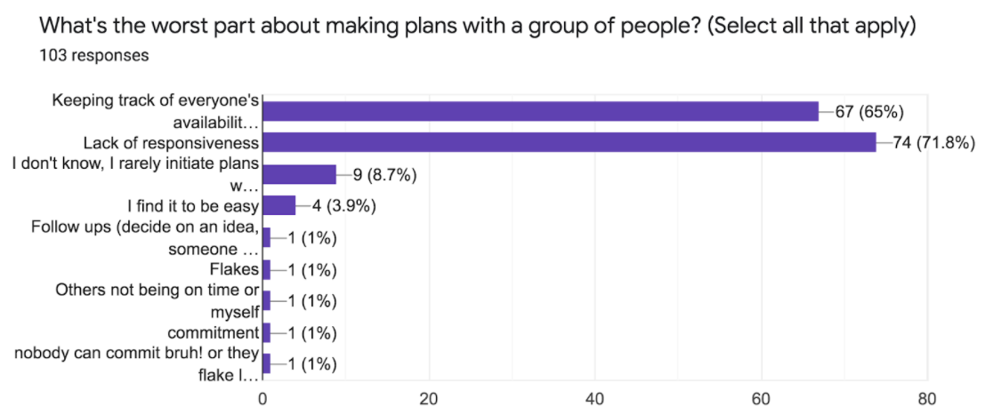
The survey confirmed that the majority of people also have trouble making plans (only 4 people found it to be easy). Most people said that the worst part about making plans was keeping track of availabilities and a lack of responsiveness.
The survey data also suggested that most people prefer messaging apps for making plans with smaller groups. For a larger group, most people prefer other platforms such as Facebook or email. A few people used a website called Doodle to survey availabilities. I looked into how each of these competitors worked for inspiration.
Next I selected 5 participants from my survey to conduct user interviews with. My interviews helped me uncover two key personas.

She initiates and finalizes the planning.

He wants to quickly let her know when works best.
Product Design
Now having better context of my users, I asked myself the following questions:
How might we help attendees vote?
By incorporating their calendars
By reminding them when they haven’t responded
1
How might we make planning stress free?
By integrating with messaging apps
By providing a few dates to vote on
By reminding others to vote
By quantifying the votes
How might we help finalize the plans?
By sending calendar invitations
2
3
With sufficient direction for my product, I mapped out the following user stories that an MVP would need to solve for:

For “Paula the Planner”
Create an availability survey
Remind people to vote
Finalize plans

For “Allen the Attendee”
Vote
Potentially be reminded to vote
Agree to plans
For the above user stories, I sketched out key screens and created a prototype using Marvel. Then I conducted a quick test with testers.
User needs became more clear after asking my testers to complete the user story tasks.
For “Paula the Planner”
Create an availability survey
Tester quote: ‘I guess I go here?’
My takeaway: starting point needs to be further explored
Remind people to vote
Tester quote: ‘Oh I’d have to leave the app to do this?’
My takeaway: explore implementing this in the app
Finalize plans
For “Allen the Attendee”
Vote
Tester quote: ‘How would I know when I needed to vote?’
My takeaway: need to show something from the planner requesting the attendee to take action
Potentially be reminded to vote
Agree to plans
I digitized the wireframes and applied the above takeaways.
At this point I felt comfortable enough with the user flow to convert the prototype into high fidelity. I started to explore styles.
User Interface Design
I knew that I wanted skedge to feel easy on the eyes. Meaning, minimal imagery and iconography to encourage user retention.
To denote a casual and relaxed tone, I used a muted color scheme as well as a sans serif typeface. I also kept the text lowercase wherever possible. The calendar icon in the logo is even subtly smiling =)
I built a component library for ease of use throughout the prototype.

High Fidelity User Testing
The sign up flow triggered many questions. It was clearly an area I needed to research more. I decided to remove the screens and revisit at a later point. Onboarding features were not a part of my MVP anyway.
Some users could not figure out how to add an availability for an event. I knew I needed a more explicit call to action to exist on the screen. I decided to do this with a tooltip.
It was also still unclear how to initiate the planning flow. The fact that it started on the “group conversations” page confused testers. I decided to rename using a call to action: “make some plans”.
After converting to high fidelity, I conducted four moderated usability tests in person and over Zoom with screenshares. Even with an updated user flow and the new nudge feature, I uncovered additional usability issues.

Take a deeper look at the latest prototype here.
Next Steps
Using this version I conducted 5 more tests. While I was glad to hear none of the previous issues arose, there are other enhancements I would love to integrate in the future.
Web based features. For attendee users, rather than having to download an app just to respond, a web based UI could be built. This would reduce barrier to entry and retain users. While planners are our key user base, at the end of the day if attendees aren’t also using the app, the planners won’t stick with it either.
Auto nudge. Rather than the planner manually nudging, the app could send out automatic reminders for those not yet responded to a poll.
This idea may have started as a way to help plan hangouts… but it actually fills an even bigger gap in the market. It is a front to back event management tool. There will definitely be more to come here!